
What Are the Elements of Good Book Design?
Good book design is something most readers rarely notice—but it has a major impact on how comfortable a book is to read.
Professional book design combines typography, spacing, margins, and page structure to create pages that feel balanced and easy to follow. When these elements are carefully designed, readers can focus on the story or information rather than struggling with the layout.
At First Choice Books, we help authors prepare manuscripts for professional printing by designing clean, readable book layouts that follow proven publishing standards.
Below are some of the most important elements that contribute to effective book design.
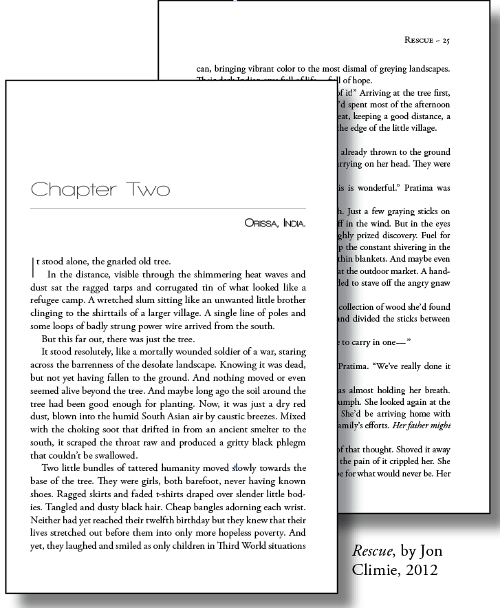
Good book design illustrated using two pages from one of our books
Chapter Openings
Chapter openings help guide readers through the structure of a book. A well-designed chapter page signals a clear transition and gives the reader a visual pause before beginning the next section.
Good chapter design typically includes:
• a clear chapter title or number
• consistent typography
• balanced spacing at the top of the page
These elements create visual hierarchy and help organize the content of the book.
Opening Paragraphs
The first paragraph of a chapter is usually styled slightly differently from the rest of the text.
In many professionally designed books, the opening paragraph is not indented. Designers sometimes use a drop cap, a larger decorative first letter, to create a visual starting point for the chapter.
This helps guide the reader naturally into the new section.
Line Spacing (Leading)
Line spacing—known in typography as leading—refers to the vertical space between lines of text.
Proper line spacing improves readability by preventing lines from appearing cramped or crowded. If the spacing is too tight, text becomes difficult to follow. If it is too loose, the page may feel disjointed.
Professional book layouts carefully balance line spacing to create a comfortable reading experience.
Line Length
Line length plays a major role in readability.
Most professionally designed books aim for lines that contain approximately 8 to 10 words per line. When lines are too long, readers have difficulty locating the beginning of the next line.
Page size, margins, and typography are carefully chosen to maintain comfortable line lengths throughout the book.
Font Choices
Typography is one of the most important elements of book design.
Most books use a combination of fonts:
• Serif fonts for body text
• Sans-serif fonts for headings and titles
Serif fonts are commonly used for long passages because the small strokes on the letters help guide the reader’s eye along the line.
Choosing the right typeface improves readability and contributes to the overall tone of the book.
Font Size
Font size must balance readability with efficient use of space.
Most printed books use body text between 11 and 12 points, depending on the typeface and page size. Books designed for younger readers or visually sensitive audiences may use slightly larger type.
Professional book designers adjust font size, line spacing, and margins together to create a balanced page.
Paragraph Indentation
Paragraph indents help readers visually distinguish between blocks of text.
Modern book layouts typically use a small indent at the beginning of each paragraph, usually around a quarter inch. This subtle spacing keeps the page organized without creating distracting gaps.
The first paragraph of a chapter is often left unindented to signal the start of a new section.
Spacing After Periods
Modern book typography uses one space after a period, not two.
Using a single space creates smoother word spacing and allows layout software to control the spacing between words more accurately.
This small detail contributes to a more consistent and professional page layout.
Margins
Margins create space around the text and help prevent pages from feeling crowded.
In professional book layout, margins are carefully calculated based on the trim size and binding method. The inside margin near the spine is usually slightly larger to account for the area lost in the binding.
Balanced margins make pages feel open and comfortable to read.
Headers and Page Numbers
Headers and page numbers help readers navigate a book.
Many professionally designed books include:
• the book title on one side of the header
• the author name on the opposite page
• chapter titles for longer works
These elements provide structure and help readers keep track of their place in the book.
The Goal of Good Book Design
The goal of good book design is simple: create a layout that allows the reader to focus entirely on the content.
When typography, spacing, and page structure are carefully balanced, the design becomes almost invisible. The result is a book that feels comfortable to read and professionally produced.
At First Choice Books, our design team helps authors prepare manuscripts for professional book printing, ensuring the final layout is clean, readable, and ready for press.