
What is Good Book Design?
Good book design is something you would never notice unless it did not exist. Think back to the last good book that you read. What did it look like? What font was it in? What size was the font? Chances are that you don’t know what the font was, or even remember many details of what the page design looked like. You may remember the picture on the cover, but other than that, what remains with you is how much you enjoyed the story. And that’s as it should be—good book design should allow the reader to get lost in a good book, and not be aware of the printed page. If the type is too small, or too large, or uses an odd font, then it may be difficult to read, and you’ll notice the design, but not in an appropriate way.
Design needs work to be effective. Here’s a typical page, with the parts listed. A designer will make choices about how all of them look. For complete information in a printable format, please download our self publishing guide.
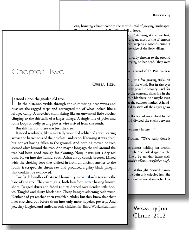
Good book design illustrated using two pages from one of our books
Chapter start
The chapter start has three decorative elements of good book design: a large sans serif font for the chapter number, a small one for the chapter title, and a line (rule) separating them that spans the width of the page. Note that the page starts down a few inches from the top, and the page number has been omitted.
Lead paragraph
A lead paragraph is usually not indented. In this example, we’ve also added a dropped capital letter (drop cap) that matches the chapter title font.
Line spacing, or leading
The space between lines, horizontally, is called leading. Books are usually single spaced, while manuscripts that are prepared for an editor’s red pen are usually double spaced. Book designers have more control over leading, and usually measure it in points. Wider leading can make the book easier to read, especially if the line lengths are long. But then fewer words appear per page, making the book longer overall. Read more about Font size and Line Spacing
Line length
These lines are kept to about 8 or 9 words per line. Longer line lengths, especially if the book is larger, like 8.5×11, can cause the reader to get lost in the line. For larger book sizes, wider margins give the page more breathing room, and keeps the line lengths shorter for ease of reading. Read more about Line Length
Fonts
Chapter headings are done in a modern sans serif font, Walkway, while the body of the book is in the more traditional serif font, Georgia. Serif fonts are more readable in paragraphs, especially at smaller sizes. Read more about choosing fonts.
Font size
An 11 or 12 point font is usually a good size for readability. But every font is different: different fonts at the same point size may be much larger or smaller than the other. Older readers prefer a slightly larger font size, but really large sizes should be used only if the book is being designed for the visually impaired, or for early readers. Read more about Font Size.
Indents
Modern typography uses smaller indents, instead of the older style of a full tab stop. These ones are set at .25”. The good book design keeps the paragraphs separated visually, but doesn’t interrupt the overall flow of the page. Small indents are especially key if you have a lot of dialogue in short sentences, as large indents can make the text look very ragged and uneven.
Space after a period
Only 1 space should be used after a period, not two. This makes the text smoother and more elegant on the page, instead of leaving gaps. Read an article about why you should never use two spaces after a period.
Minimum Margins
The book measures 6”x9” in print, and has outside margins of .5”, top and bottom of 1” inch, and an inside margin of .75”. (How to set up margins.)The inside margin will appear smaller once the book is bound, so it is set up .25” wider than the outside margin. EXAMPLE of minimum margins
Header
Modern book design combines page numbers with the title of the book at the top, for a cleaner look. Headers often list the title of the book on the right hand page, and the author’s name on the left. It is also an option to have the name of each chapter or section appear in the header.