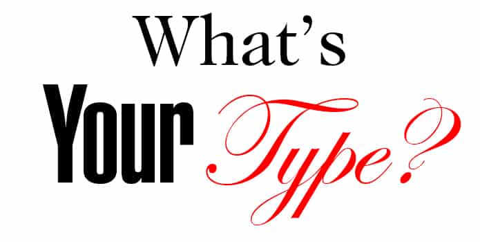
The choices in type (fonts) are seemingly endless. From traditional Baskerville to new, popular (and sometimes, infamous) choices such as Papyrus and Copperplate Gothic, you have a wide array from which to choose.
Target Market
First, identify your target market. Are you writing for seniors? Children? Is your book one of recipes or poems? Poetry or prose? Your target market ultimately influences your choice in type. After you’ve identified the sort of reader towards which your book is marketed, decide on a style that you prefer. You could go through similar genres and identify the type that the author used.
What is a typeface?
A typeface contains one or more sets of fonts, which is its font family. You’ve probably used the terms “typeface” and “font” interchangeably, or know people who do, and this is due to desktop publishing blurring these lines a bit. However, the proper term for a set of fonts which share a uniform “style” is typeface. Confused yet? Don’t be. Most desktop publishing programs make it easy for you to see which fonts belong to which family. Try to stick to 2 or three typefaces in your book — if you want to get creative, branch out using the different fonts within these typefaces’ “family trees”! For example, you may use a “plain” font for the body text, an italic font for the captions and a bold font for your titles — all in the same typeface.
Serif Typeface
Serif typefaces are those with semi-structural “details” on the ends of some letters so as to enhance readability. Examples of Serif typefaces are Times New Roman, Garamond, Palatino and Baskerville. Serif typefaces are said to be the easiest to read, which is why they are so often used for body text. Setting your paragraph to left justify and using a common serif typeface such as Times Roman will give you a tidy design. From there, you can get more creative, adding an artistic typeface for your headers, or you may use members of your serif typeface’s font family to achieve your desired effects.
Sans Serif Typeface
You’ve probably noticed that newspaper headlines are not usually in a Serif typeface. Sans Serif typefaces (as in, typefaces without serifs) are a popular choice due to their bold, clean look. You might not want to go this route if you’re writing a memoir or a romance novel, but the choice is ultimately yours — just remember your target market. Your traditional novel may look great with a “fancy” or delicate typeface for chapter headings, but a technical manual on car repair would likely look better, and appeal to your customer with a Sans Serif typeface for headlines and titles. Examples of Sans Serif typefaces are Arial, Helvetica, News Gothic and Lucida Sans.
No matter which typeface and font you choose, just ensure that it’s readable, legible and appropriate for your audience, and you’re all set!
Kelly


