
Book Design and Covers Have Evolved Over The Years
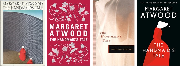
Book cover design has evolved over history. The use of typefaces, colors, images, and other elements in book design now differs considerably. We may compare the models of the same iconic novels and see how they look vastly different from their first edition book covers and the newest ones. The same book in every decade can look very different.

Books tell stories with graphic design
Books tell stories or provide us with knowledge on a variety of issues. One of the main purposes of having a book cover design is to provide the potential reader, when looking at the cover, with a glimpse of the stories and information inside. Another purpose of the design of the cover is to interest the reader in the book. The starting point for a publisher to sell books is an attractive book cover. Too often we don’t know the importance of graphic design in our daily lives. Each piece of information that we deal with is planned in some way, and whether we understand it or not, what is certain is that good design works better and more efficiently than bad design. Graphic design can really improve our lives from well-designed posters in a successful advertising campaign to a book that is even more pleasurable to read due to its excellent typesetting. Graphic design is a mix of interactive images and words. Designers have created inspiring and outstanding graphic design since the invention of the printing press. Every book tells a different story. Books are also the source of unique information. Every layout of a book is therefore different from another. But that’s not the only reason for the wide variation in book covers. In the marketplace, there is competition to attract readers. This has given rise to the ever-changing styles of book design.
A new book design for every decade
Another important thing to consider when thinking about trends in book cover design history is that a book does not have a permanent cover design. After a decade, a book published today may not have the same design as its new editions. Even novels, poetry books, and short storybooks, when they appear for sale, have a completely different cover design. This is due to the new trends in design that have emerged over the years. An excellent book cover design has the main function of communicating the story inside the covers. The ability to inspire curiosity in a story or detail is the strength of a cover design. This is why book design trends are so constantly evolving. Those from different eras have a different taste that is reflected in that era’s designs. And, even after a few decades, a book cover model from the 1950s will no longer be relevant. Today, the same book has a different cover model than it had in the 40s or 50s. Keeping that in mind, it will be interesting to study how some of the popular books’ book cover designs have changed over the years.
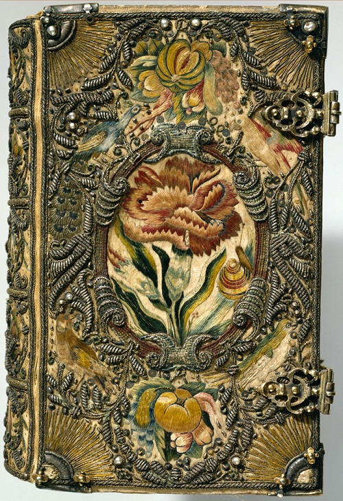
Textile book binding The Netherlands, 1615-1620
The utilitarian gave way to the imaginative and impressed leather covers, which was the standard in the late 18th and early 19th century. In addition to providing protection for the internal pages — a cover’s original purpose — covers became more and more representative of both their content and their owners’ status. As the 1800s progressed, so came the industrial revolution, iron presses began pushing their traditional wooden counterparts out, also fabric began to replace skins, making it easier and more flexible to cover the boards of a book. The engineering of silver and color hot foil stamping allowed artists to pursue more imaginative presentations. With the advent of fabric, dust jackets were created for covering silks and more fragile materials in a protective capacity. Some of the oldest book coverings took years to create, patiently stitched by hand with precious gold and silver threads, as you can see above.
Bold Typography is a Classic
Bold and plain typography was king in the early 20th century, although this was partially reversed by the 1920s post-war cultural revolution. A world of symbolism and color entered the mainstream, with publishers reaching out to fine artists for covers. Such artists and the subsequent graphic designers used sophisticated imagery to subtly express plot /tone/character in ways that conventional illustrators could not. The 1930s saw a paperback revolution that made the common consumer accessible to both classics and trade works at cheap prices. Penguin was the most successful publisher of the era, launched in 1935, thanks in part to his universal motif with genre-specific coloring and consistent type. The company stood out in a growing paperback industry with universal branding, in which the industry relied on inconsistent, graphics-heavy covers.

Penguin book covers for George Orwell’s 1984 – including a black out version. The black mask wears off the more the book is handled and read.
For much of the 20th century, the graphics-heavy covers dominated a certain industry sector. There was some great experimentation with abstraction/illustration/ type in the 60s and 70s, and then the ability to print photos easily on covers led to a shift in photo-heavy covers, a trend that continues today. And that takes us to the here and now, where competition is steep, pushing publishers to reinvent the proverbial wheel of cover design — it’s tough, but worth it! Whether inspired by the past, using bold graphics or full colour photographs, covers can be anything you want.
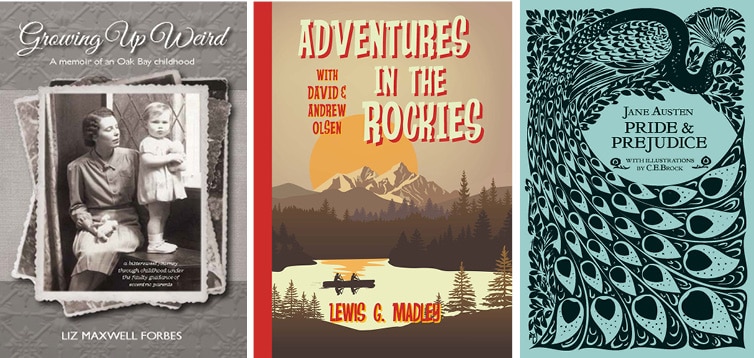
Recent cover designs inspired by vintage designs, by First Choice Books
First Choice Books is a premier, Canadian, self-publishing company. We publish books easily, affordably & beautifully. Get your self publishing quote here!